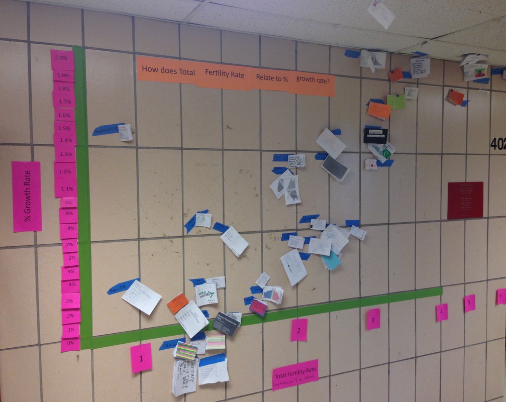
Human Population Growth Project Graph
At the conclusion of the human population research project, students created a large graph on the wall outside the classroom. They hung up their country flipbooks as data points on the graph, according to growth rate (Y-axis) and fertility rate (X-axis). We used this visualization to practice interpretation and data analysis skills and spent time in class discussing the trends noted in the data